BTC Is Looking Bullish If Price Break The Resistance At Level 92311 Place SL At Level 90,519 And Place TP At Level 95,600
Key data points
Previous close
—
Open
—
Day's range
—
About Market Cap BTC, $
Coin
On a stock market, a company's market cap can indicate how well it is doing — just like that, crypto market cap might be a good barometer for crypto investors. A growing market capitalization means investors are positive about a coin and are willing to invest — so if you're in two minds whether to buy Bitcoin or not, the chart of Bitcoin market cap might come in handy. It displays the total value of Bitcoin which is the number of coins in circulation multiplied by their price — analyzing this line can give you an idea of how Bitcoin is doing and where it's heading.

BTC WARNING!⚠️ WARNING:
I’m giving this to you straight, no filter.
Bitcoin is now staring down a very real chance of not making a new high for up to 4 years, and historically that kind of setup has come with –80% drawdowns.
That would drop the total market cap to roughly $500 billion.
Social media makes it

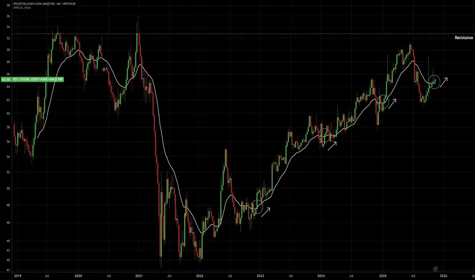
REAL BTC Dominance compared to FAKE BTC DomincanceThis is real BTC Dominance Chart By subtracting Mcap of major stablecoins like USDT, USDC and DAI Compared to gross btc dominance (BTC.d)
The major misconception that has gripped the crypto market is the gross BTC Dominance.
From 2022, there has been an enormous amount of stablecoin creation by m

REAL BTC Dominance removing USDT/USDCThis is real BTC Dominance Chart By subtracting Mcap of major stablecoins like USDT, USDC and DAI.
The major misconception that has gripped the crypto market is the gross BTC Dominance.
From 2022, there has been an enormous amount of stablecoin creation by multiple US firms. The Stablecoins are n
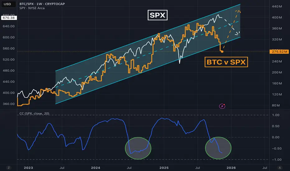
Upcoming rotation from big tech to crypto?Tech SP:SPX and crypto CRYPTOCAP:BTC have been tightly correlated despite suggestions that crypto is a hedge. Therefore it's surprising to see the relative outperformance in tech this year.
In fact, Bitcoin has just gone negative on the year, while the stock market is up double digits again aft
Bitcoin Geometric Ghost of Bitcoin Past and Future. I used my intuition for this hypothetical theory.

Bitcoin No Math — Lover’s Pulse (BTC/WM1NS):the trend line fits like a vein, not a ruler. Bitcoin’s fractal feels like it breathes hugging the trend line like a lover.

Bitcoin’s Triple Cycle Overlap“Bitcoin’s Triple Cycle Overlap” reveals three distinct, self-reinforcing rhythms in Bitcoin’s price history:
• 4-year cycle (red) — tied to halvings, driving short-term bull/bear phases
• 8-year cycle (blue) — reflecting adoption waves and institutional entry
• 13-year cycle (green) — capturing

BTC/GOLDThe BTC/GOLD ratio just broke a multi-week descending trendline and pushed above a tight moving-average cluster, signalling trend transition from compression → expansion.
Momentum and breadth indicators have flipped bullish; this could be the onset of a 6–9 month relative outperformance cycle for B

Bitcoin Location Road AtlasSimple Bitcoin is Mid-Cycle. Based on historical fractal behavior. BTC/WM1NS

See all ideas
Summarizing what the indicators are suggesting.
Oscillators
Neutral
SellBuy
Strong sellStrong buy
Strong sellSellNeutralBuyStrong buy
Oscillators
Neutral
SellBuy
Strong sellStrong buy
Strong sellSellNeutralBuyStrong buy
Summary
Neutral
SellBuy
Strong sellStrong buy
Strong sellSellNeutralBuyStrong buy
Summary
Neutral
SellBuy
Strong sellStrong buy
Strong sellSellNeutralBuyStrong buy
Summary
Neutral
SellBuy
Strong sellStrong buy
Strong sellSellNeutralBuyStrong buy
Moving Averages
Neutral
SellBuy
Strong sellStrong buy
Strong sellSellNeutralBuyStrong buy
Moving Averages
Neutral
SellBuy
Strong sellStrong buy
Strong sellSellNeutralBuyStrong buy
Displays a symbol's price movements over previous years to identify recurring trends.